Sunday, June 7, 2020

The biggest show in town

Here's some doodles I made to test out my line of action abilities. It ain't fantastic, but it's better than what I've done before. Huck Hound is a lot of fun.


And now to mess it up:
Inking with a laptop mousepad is a pain and it looks like crap. Maybe I'll reink it if they let us back in school next year.

Tuesday, May 21, 2019

Graphic Design Q2 Reflection


This quarter, I did a lot of graphic design work. Here are my 3 favorite projects. Make sure you check out my Behance.  https://www.behance.net/furmancolia180

3 Favorite Projects
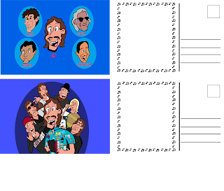

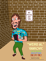
Probably my favorite project was the event advertising. (click on them) For this project we had to pick an artist, and design a poster, a ticket design (not pictured) and 2 postcards for an event featuring them. I chose Weird Al.  The project took a good while to complete, and I did have some trouble getting everything done due to the large amount of stuff I had to do all on my own. Eventually I did manage to finish it all, and the results turned out well. I also had some technical issues; on the bottom postcard, I used a pathfinder option to group them all together instead of the group tool, which lead to problems that are kinda hard to put into words. I learned how to use the pathfinder tools better during this project. I consulted with the teacher a lot for feedback, and she helped me on making the wall in the poster. My original design for the poster was a lot less interesting, but I decided to go with a design inspired by the poster for Michael Jackson's The Dangerous Tour. Since Al is a parodist, I decided that a parody of another artist, particularly one Al is pretty closely associated with would be fitting. I thought this project was great.
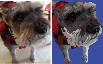


Another great project was the vector portrait. For this project, we had to take a photograph of a living thing, and use a certain technique in Illustrator to make a portrait. This took a while to create, maybe more than the event advertising. This project took forever to make due to the amount of detail I put in. I'm not sure if I learned any skills while making it. I consulted with the teacher again whenever I got stuck, and she helped me a lot.  My original idea had my dog, but his fur didn't have enough colors to be turned into a portrait, so I chose my grandma's dog. I'm really proud of the fur, but the jacket and background could of had more detail.
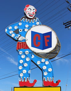
My last project of the year was designing a personal logo. The clown was not part of the design.  This project took a lot less time to design. I had problems choosing the color palette, and my teacher was kind of persistent on making me choose a lot of different designs. I chose to go with the design on the left. My original design was a cube instead of an arrow, but I couldn't get the top part to look right. I thought this project was a good final project.


Strengths

I am really good at using Photoshop and Illustrator, and I am still very creative. I can communicate with others better now, and I can finish projects while still maintaining a high level of quality relatively quickly. We didn't really collaborate with anyone this year, but I bet I could do that.

Weaknesses

I may need to spend more time on projects, as I might be too fast on some projects. I'm not very good at using InDesign. 

Conclusion

I enjoyed being with Mrs. Beaudoin and working on projects. However I do think that the class was sometimes way too loud, which prevented me from hearing the stuff I wanted to hear. I thought the class was great, and it was one of my favorite classes this year. I think Mrs. Beaudoin should continue doing what she did this year.

Monday, December 17, 2018

1st Semester Final Report


I thought I did good this quarter.  I am very skilled with the tools in Photoshop and Illustrator, and can make a lot of good stuff with it. My blog is still the same as it was last year, but my Behance now exists and has a couple of my projects.

Infographic

I created an infographic in class, probably the best project of this semester. It's all about opinion host Sean Hannity. Unfortunately Blogger is a piece of crap, so I cannot upload it. If you look hard enough, you can find my Behance. It took a couple weeks to make it, but it was worth it. Challenges were drawing the pictures in real life, which for some reason I was required to do. My original idea had a lot more text than photos, but my teacher said I should add more photos, so I made a lot more photos to go along with the text.

Photoshop Challenge

I also took a couple of photos and combined them into a new picture. While not the best of the semester, it was pretty good.

Fortunately, I had previously uploaded this project, so I can show it here. This took probably just a week to make. My favorite part is the camel in the back. Camels are pretty cool. My original idea didn't have the clothes colored, but I decided to make it stand out more, so I used the hue tool to recolor it. 

Time Management

I thought I managed time well. I finished some projects early, so I had a lot of free time. I spent this time working on personal projects, that I should probably post more of. My strengths are probably my experience and skill with Illustrator and Photoshop. I loved working on most projects. If I had to change anything, I would remove the Pop Art project.

Monday, November 5, 2018

Watercolor Transfer

This was a very interesting project. I took 2 of my previous projects and printed them out. Then, I painted 2 pictures with watercolors. After that, I spread ModgePodge on the printed pictures and put them face down on the watercolor picture. A day later, I rubbed off the paper, which was really hard on my finger. A little more rubbing the next day finished the project, and I put the best one on display.

If I could redo the project, I would put more detail in the watercolors. I thought the printed picture transferred well.


Tuesday, October 16, 2018

Printing Processes

Relief Process


This process does not require a press, it just needs a baren. You take a thin piece of paper, put it on a block with the design you want, rub the baren on it, and the design is transfered. You might need this skill if you can't afford a printing press, or you want a good arm workout.

  1.  Get a pattern block.
  2.  Get thin paper & a baren.
  3.  Cover the design block with ink.
  4.  Place paper over block.
  5.  Rub baren over paper. Make sure you thoroughly go over every spot.
  6.  Lift up paper.

 Intaglio Process

This process has a design under what you're going to put it onto. You might want to use this if you want a deeper cut.


  1. Take a steel scribe or any similar tool.
  2. Use it to make lines on the surface you're putting your design on.
  3. Continue until you've finished your pattern.


Lithography

Lithography involves putting a design on a stone, putting grease on it, wiping off the grease, and putting it on paper. This is useful for people who like stones.

  1. Make your design with grease pencils on the stone.
  2. Apply printing ink to the stone.
  3. Apply gum arabic.
  4. Apply acidified gum arabic.
  5. Apply another coat of gum arabic.
  6. Buff the gum arabic in.
  7. Wash it with lithotine
  8. Go over the stone with both a wet and dry towel.
  9. Put the paper on the stone and transfer. It might take multiple prints.

Thursday, September 27, 2018

Pop Art


Here under protest, ANOTHER blog post. For this assignment, we had to take pictures of a partner. Being in a group of 3, I opted out of having pictures taken of me. Nobody really inspired me that much, since most pop art artists from what I understand were morons who think modern art is actually good. Think Judy Funnie from Doug. I chose cool colors because I like those colors. The colors of the shapes in the background were chosen because they look nice together. I used the filter gallery on the subject.

Tuesday, September 11, 2018

Photoshop Challenge


In Graphic Design we had to photoshop a picture of a man somewhere. I thought "Hey, where's the most remote place he can be?", so I put him in the desert. Originally it was just the original photo in the desert with a camel. However,  that felt too bland, so I added a turban and recolored the jacket. In retrospect the color scheme might be a little weird looking. I used masks to remove the white background and to recolor. The drop shadows are either adjustment layers or mask-related stuff. I thought it turned out pretty good. If I had to redo it I'd add one more thing and recolor the clothes.

Monday, August 27, 2018

Photoshop Basic Photo Editing

In graphic design I learned how to use tools in Photoshop. Some of them I already knew how to use.


For example, I already knew how to use the Content Aware tool, shown here.

 Using the patch tool wasn't very hard either, since it's so similar to the Content Aware tool.

The clone tool does not work like the tool in Paint.net, and is unnecessarily complex, so this one was a bit harder.

Much of the same here.

This is getting redundant, isn't it?

This one had a lot more steps, but I think I did ok on it.

Next post is probably going to be more of the same, so you're probably not gonna miss much.

Wednesday, May 23, 2018

E9 Reflection

Our project was the iPillow. It took most of the time we had. We had problems coming up with an idea. We learned alot of stuff. Some of our ideas were already done, so I guess that's feedback. I thought we did a good job.https://youtu.be/kl1RLpEfIgI

I completed the website. I also threw the pillow in the ad. I think I edited the website some when I was done. I didn't really do anything out of e-Comm.

I'm pretty good at video editing, even if they didn't use mine. I need to work on web design. My favorite part was coming up with the product and logo design. I would change the product concept. I learned about working with others.  My goal is to talk to people in groups better. My final thoughts are that this is one of my only good class so far.

Wednesday, April 4, 2018

Howdy Attack


Dexter must pay for his crimes against Pashmina. The Grand Howdy Army is ready for the attack. The Howdies have Dexter cornered. He has no escape, and he will surely be brought to Howdy Court for his crimes.

Tuesday, March 6, 2018

CSS and CARP Design


Another website. This was a bit of a hassle to preview, but I eventually got it to work. There were a lot of changes between the original site and the final product. The final product has a lot more color and variety.

Contrast was added by the different colors and font types.

Alignment was added by making the poem go to the left.

Repetition was added by the different shades of brown

Proximity was added by aligning the poem to one side.

Friday, February 23, 2018

House


In class I worked on a house. It looks a little crummy but I think it's passable.

I modeled it after this house. I thought it was a nice and simple looking house. Perhaps I was a bit wrong on the simple part.

Here is a video showcasing the finished product.

I used a couple textures from the internet/recolored versions of default ones. The wall texture was a default one rotated, so I don't have a picture of it.


Friday, January 26, 2018

Ball animations


In my first project of 2018, I made a couple ball animations. I feel like they came out well.

The first one is rather simple, just a ball bouncing up and down. 


The second one is more complex, however I do think I should of made the ball
squish upon impact so it looks less rigid.


The last one is probably the most complex. There's a background, and animated fire, though I'm not sure you'll notice since it's going so fast.

What I would change

I would change the color of the grass in the first one to match the rest. I would, again, also make the second one less rigid.


Friday, December 8, 2017

Logo

In E-Comm I worked on creating a logo for myself. The creation process took a few days, though if I didn't have to go to other classes I probably could of done it in one day. Whether that's a good thing or a bad thing is debatable. I sketched it, then made a mock up in black and white, then I made a couple variations in different colors. Finally, when I decided on a color scheme I scaled that up. Here are some images of the process.
Black and white mockup


Different colors

Finished product

Design wise, I tried to make a logo similar to an old Hanna-Barbera logo from 1958.

Color wise, I tried to chose colors that went together. I'm not sure why I chose that font.

Friday, November 17, 2017

Oz Poster

In graphic design I redesigned a poster that the school used a few years back to use the CARP principles.

Contrast

I used contrast when designing the logo, making it the largest and most notable object on the poster. I also used 3 main colors that contrasted well for everything.

Alignment

I used alignment a lot. I tried to make stuff line up, and I think I did a good job.

Repetition

I used repetition with fonts and colors. I used a lot of yellow at the bottom, and used many of the same fonts there too.

Proximity

I used proximity in many places. At the bottom I tried to group together many things that I thought went together, and I think I did a good job here as well.

Friday, November 10, 2017

Name thing


Overview

This was ok. I guess learning about the different parts of text was interesting. 

What I learned

I learned a lot about what the parts of text are called.

What I would change

Considering it's just copying off another paper and change it to apply to you, there wasn't really much to change.

Logo Color Scheme

Analogous


This logo uses the analogous colors of orange, green, blue and yellow. I think they chose these colors because orange represents creativity, and Windows can help you create incredible things, green because it represents growth, and Windows can help you achieve that.


This logo uses the analogous colors of orange, red and green. I think they chose these colors because orange & red are bright colors, and tend to catch attention, which is what you want for a gas station.


Complementary


This logo uses the complementary colors of purple and yellow. I think they chose these colors because purple is commonly associated with royalty, and the fairies in this show have crowns. Yellow is also associated with happiness, which is what the fairies strive to cause.


This logo uses the complementary colors of orange and blue. I think they chose these colors because orange is the color used by the main Nickelodeon channel, and blue because it can mean friendliness.


Warm

This logo uses the warm colors of red and beige. I think they chose these colors because red is energetic, which is an accurate way to describe the show. I think they chose beige to balance out the intenseness of red.


This logo uses the warm colors of orange and yellow. I think they chose these colors because orange means fun, and they want you to have fun with their games. I think they chose yellow to make it look more like a sun.


Cool

This logo uses the cool colors of blue and teal.
I think they chose these colors because the ocean is blue, and SpongeBob takes place underwater.


This logo uses the cool colors of blue and dark blue. I think they chose these colors to make it look like ice.


Monochrome

This logo uses shades of grey. I think they chose this color to make it look futuristic.


This logo uses shades of brown. I think they chose this color to make it look like rock.


Triad

This logo uses blue, red and yellow. I think they chose these colors to attract attention, as these colors do just that. I also think they chose yellow and red because buns are yellow, and hamburgers are brown, which looks kinda like red.


This logo uses orange, yellow and blue. I think they chose these colors to attract attention, as these colors do that too. I also think they chose it to make it look sunny.